Design Case Study Template: Arkus Nexus
Executive Summary
Project Name: Arkus Nexus Website
Client: Arkus Nexus
Project Duration: 8 weeks
Services Provided: Research and Web Design
Project Objectives: Redesign a website that meets business needs
My Role: Design Lead
Challenge
Context: As the sole designer and project leader, I had to interview stakeholders in English and carry out the entire design and research process with the marketing team.
Problems:
1) Redesign the website in 4 weeks (this was critical).
2) Obtain the company's own graphic resources and receive corporate information to feed the web redesign.
3) The rounds of revisions were complicated to agree with the client's schedule.
4) The company lacks a brand manual, as well as a web style guide.
Solutions
Creative Approach: First I made the decision to see all the evidence of design languages, then I searched for information and finally I made a documentation where I saved all my UX/UI analysis. Then I made a schedule for us to solve the task in 4 weeks.
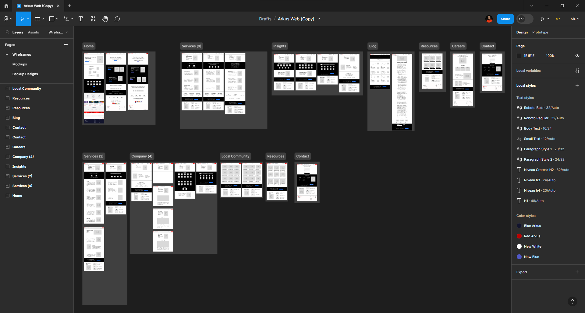
Key Elements: I was given a brand manual, very poor. Then I created a style guide. For the UX part, design a new navigation map, determine user tasks and user flows to start with wireframes in the next stage.
Tools Used: Figma, Figjam, Adobe XD
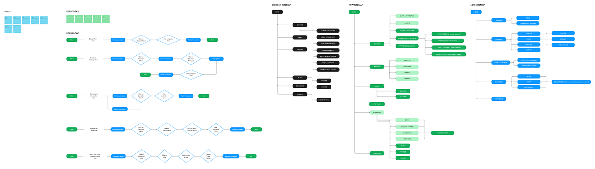
One of my solutions was to reorganize the information architecture because it felt very confusing between the information that appeared on the website and what the stakeholders talked about during the first qualitative interview. I then evidenced the sitemap versus my proposal, and finally, we concluded with a collaboratively built version.
Wireframing Stage
At this stage I made a versus. The actual design versus my proposal. The purpose was to validate with the stakeholders the need and the right path to follow.
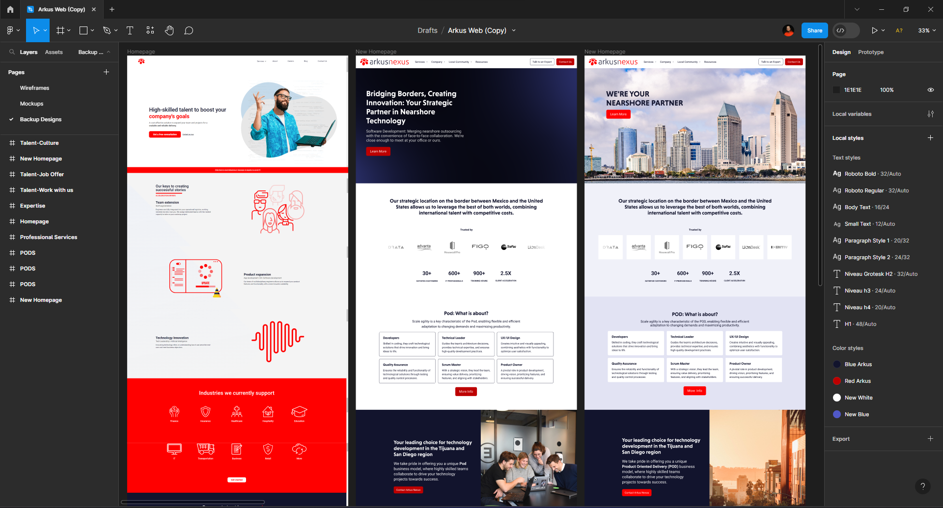
From my side as a designer, I established design patterns to achieve the goal of generating more leads through repetitive calls to action during navigation, because that was the initial requirement.
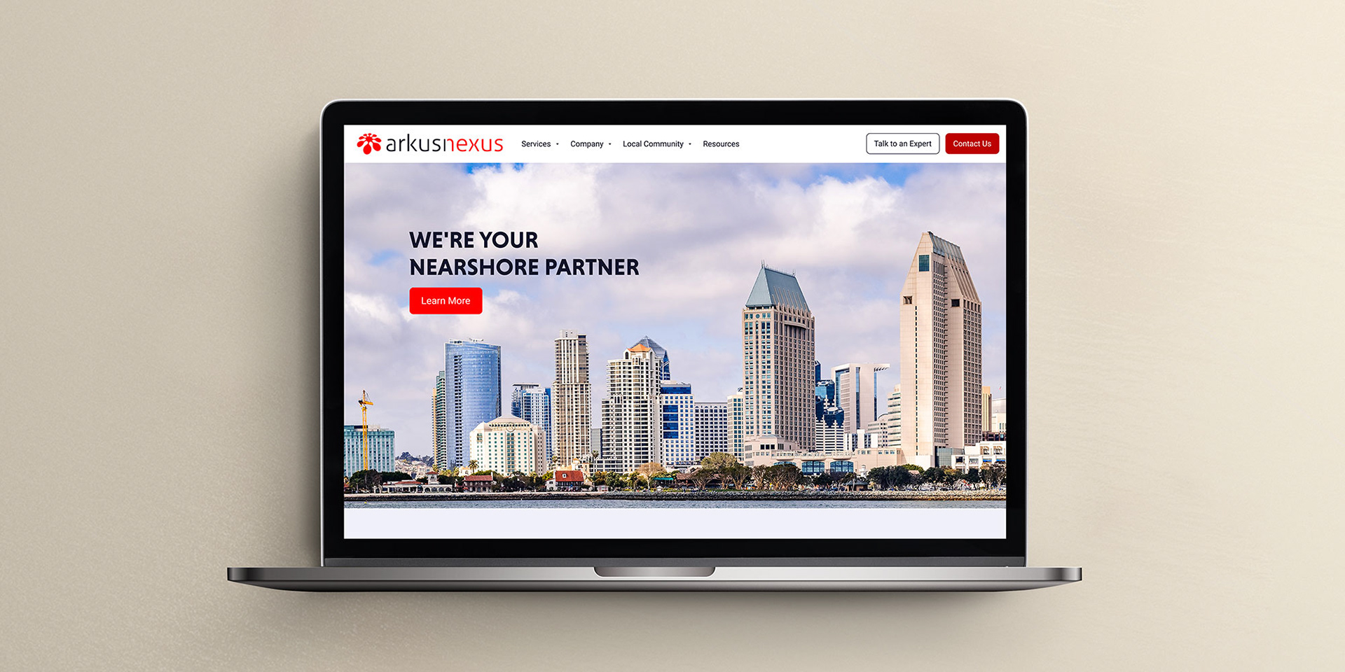
Web Style Guide
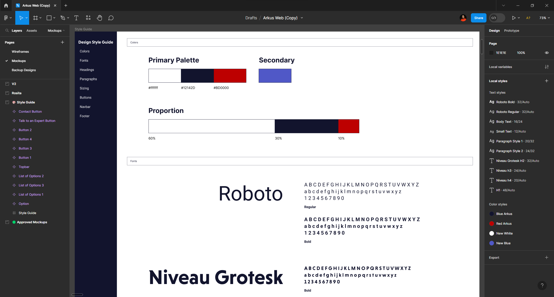
I used the brand manual as a reference and only had to improve the red tone, because the CEO found it offensive. Then the idea was to create components that would speed up the design process and show daily progress.
Hi Fidelity Mockup
Need help with your business?