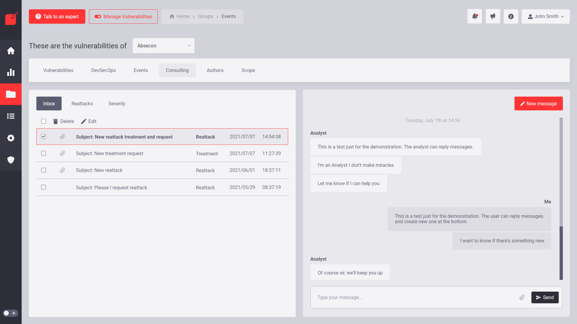
Overview
This is my first experience as a digital product designer. I came across a rustic product, created by engineers. No usability testing and lack of research and design system.
The company Fluid Attacks had not invested time in user research. The risks of continuing like this were going to impact user engagement, leaving the company as a customer, increased user friction, support tickets, frustration, among others.
I had to solve deep usability problems and user research. So the main goal was to modernize the web application, focusing on human-centered design. ASM is an application that provides pentesting services with a SaaS business model.
Platform
Desktop web application
Year
2019-2022
My Role (team of one)
User research
Interaction designer
Prototype
Design System
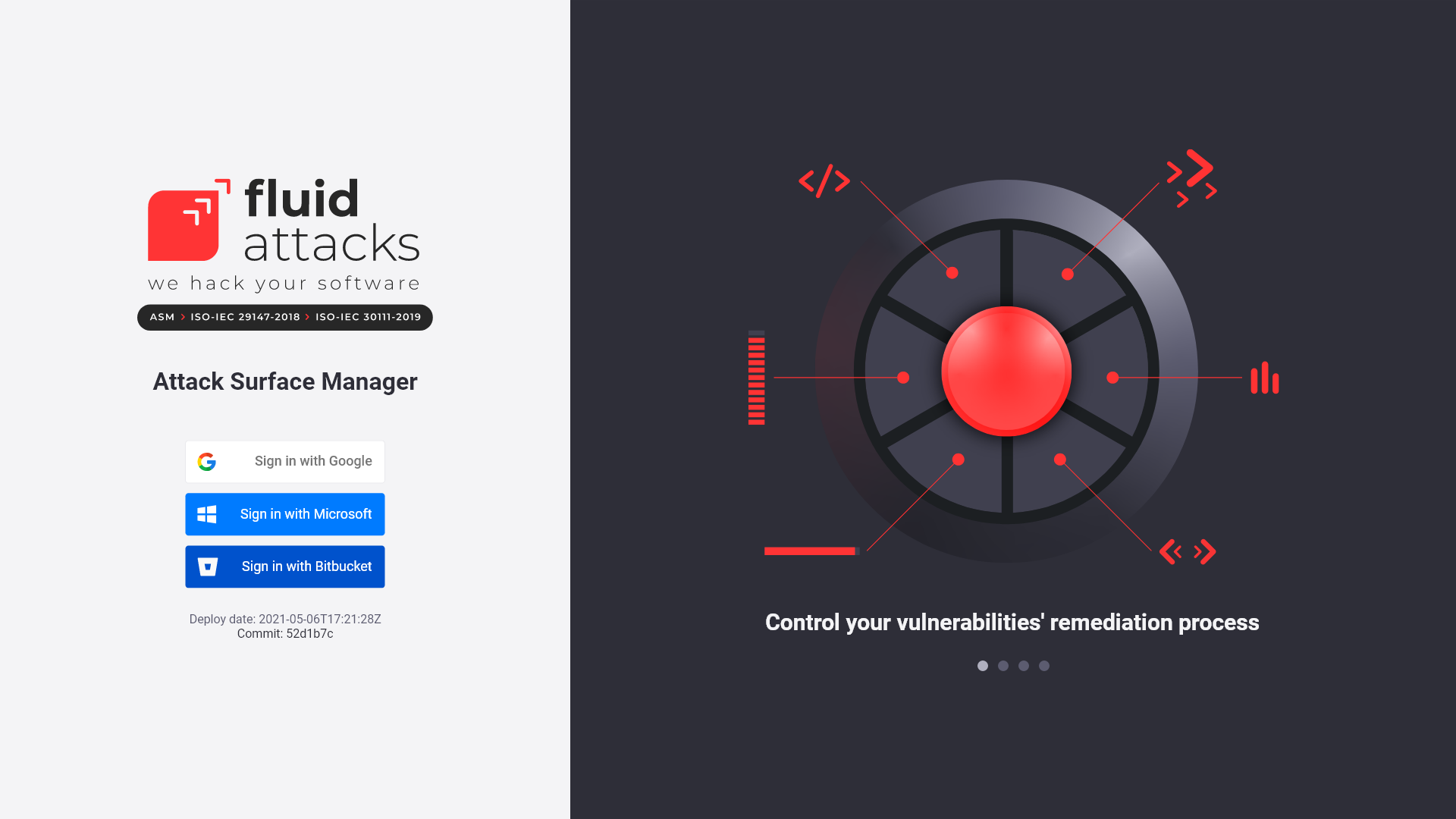
Sign in to ASM
Highlights
In February 2020, this company had 56% of satisfied customers, few responses and a lot of detractors.
In 2022, two years later, it increased to 66% of satisfied customers and decreased detractors. I succeeded in achieving my goal: to create user-centric solutions.
Design Thinking as a Framework
Problems
During the user research I identified 6 several problems with the old website:
1. Limited user session
A few years ago the company established that for security reasons the sessions had to be kept active for a limited time. This was a deep and important pain point for all users.
2. Slow
The negative user comments on the NPS were very clear. It is a pain point and causes a lot of frustration. ASM loading was slow compared to other platforms, and users complained.
3. Confusing information architecture
Sections repeated throughout the navigation. There is also user confusion over certain words in interface components.
4. Constant micro changes
The company's philosophy is to deliver daily value to the user using micro changes in the application.This represents a deep pain point for users who are learning to use the application.
5. Lack of user research
User research began to be conducted for the first time in the company in 2020. The findings were astounding.
6. Lack of consistency
Our mission is to work with the development department to create a library of reusable components to create products at high speed.
Opportunity
How can we create a human-centered product?
Goals
1. Limited user session > No limit
The business model changed. In order for the product to grow without human intervention, the time limit per active session was removed.
2. Slow > Fast
The company migrated to a more modern technology with the possibility of exponential growth in the short term.
3. Old information architecture > New architecture
The adoption of a new information architecture is the main proposal and it´s the key for a better user experience.
4. Micro changes > Collaborative workflow
My professional goal is to help the development and product team grow with design thinking method. I am working on that to make my dream come true.
5. Lack of user research > Active user research
I am running faster tests by testing user flows to validate experiments with stakeholders and customers.
6. Lack of library > Official library
I am still working on building the company's official component library where every day we share ideas with the development leader.
THE CHALLENGE
The most important challenge is being one team member. I started working for the company when the marketing team joined. There are no precedents for user interface and experience design. The company has a development and hacking team with which I maintain a close relationship.
Define a Design System: I came across an application with no hierarchies and an unfriendly color palette. Attack Surface Manager development progresses every day at a very agile speed so I have no much time to do some usability test.
Communication and improvement: The most frequent challenges are poor communication and acceptance of UX and UI improvements from experts users. In this challenge I incorporate the creation of new user flows to simplify tasks and make the platform easier to use. Heuristic evaluations were also important criteria in defining my design process.
Develop the first design system
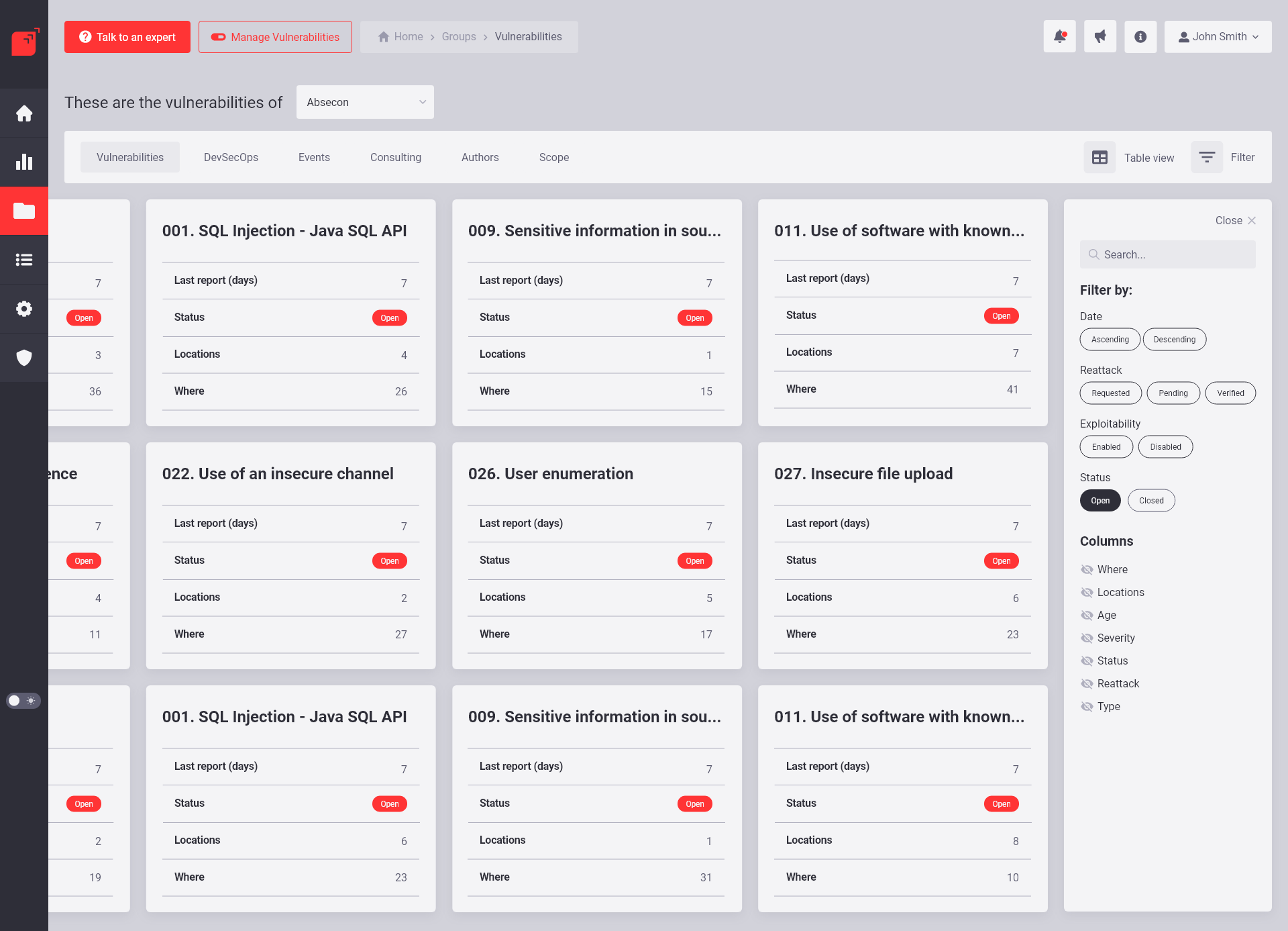
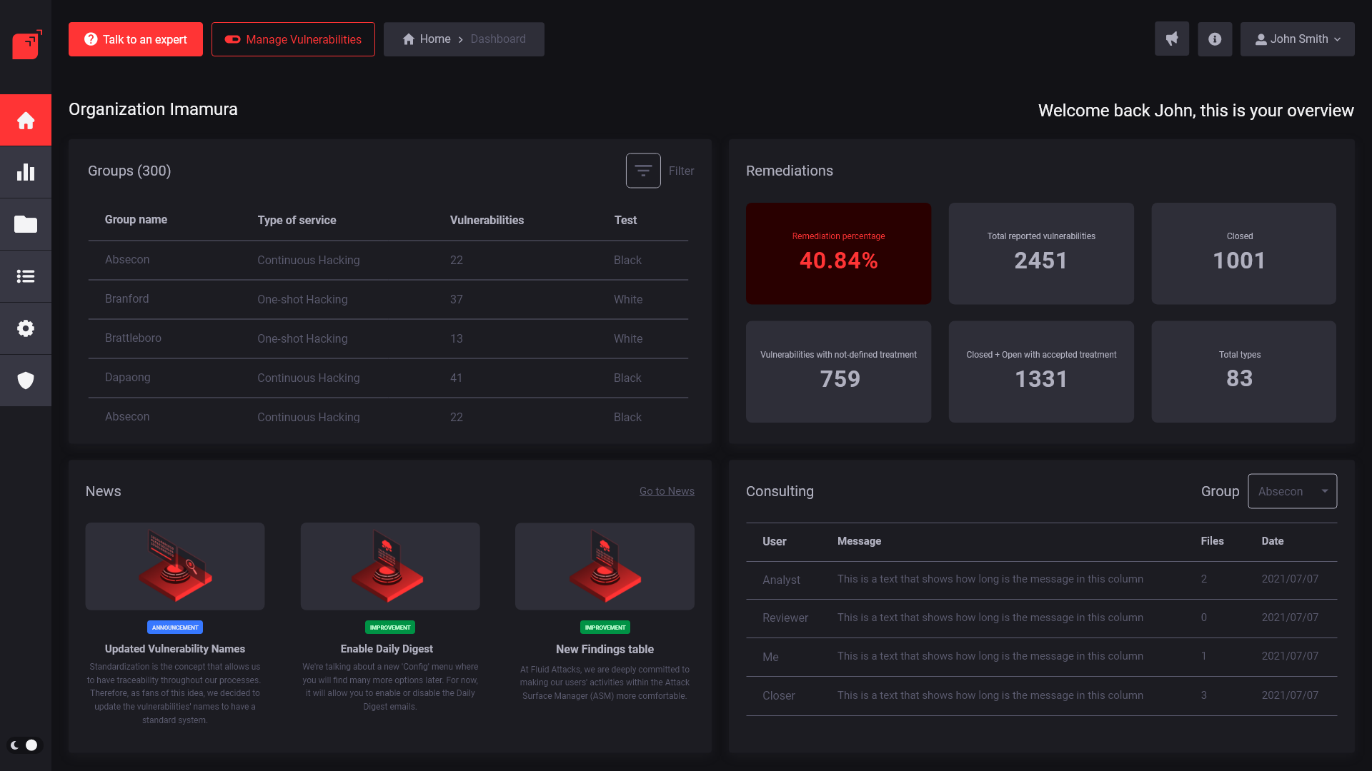
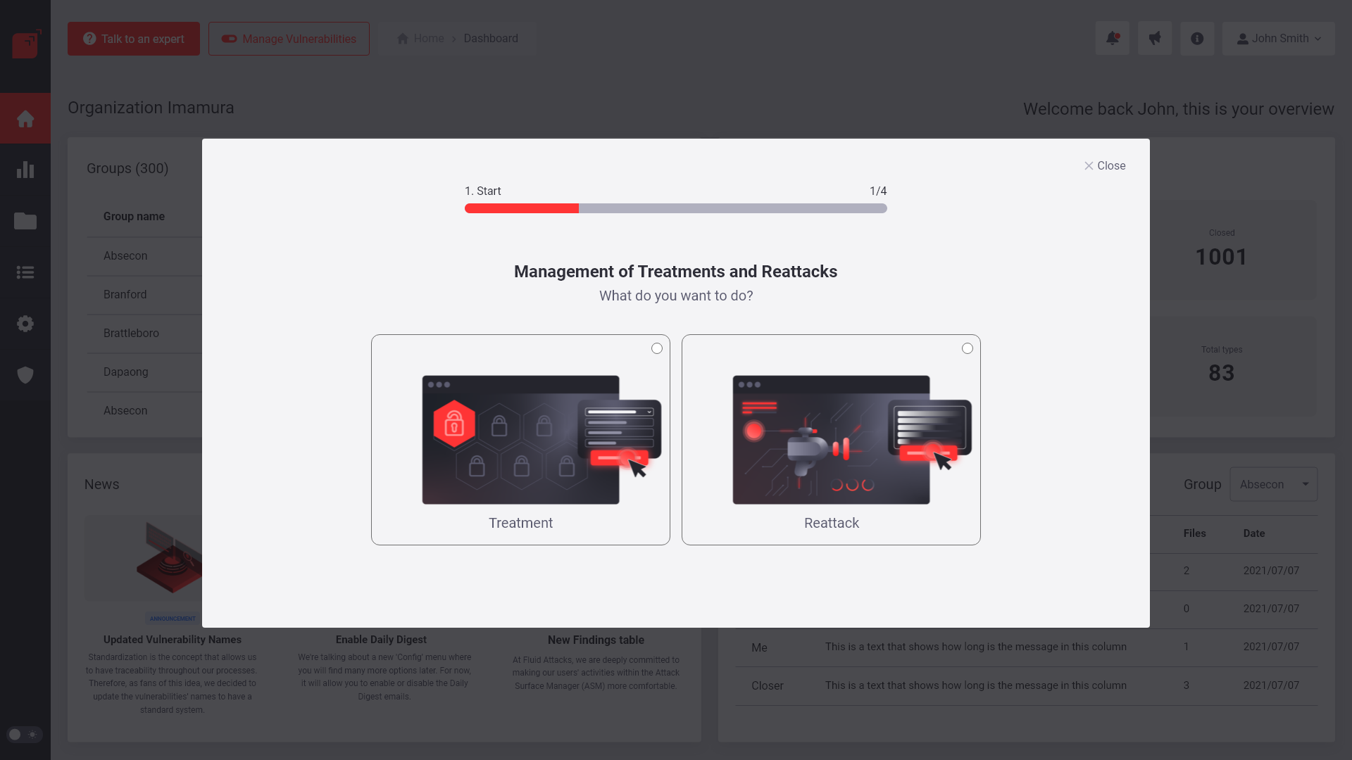
The backbone of the new Attack Surface Manager (ASM) was based on the Fluid Attacks design system. I used html, css and js to share my vision to development team.
Working on the design system: https://friendly-cheesecake-839b5e.netlify.app/
Stage 1: Empathize
OBSERVATION
I made observations of the application since July 2020. When I first logged in I tried to understand the functions but I got frustrated. I couldn't clearly understand what the primary tasks were. I also did research on the competition but they don´t use free demos. This seems interesting to me because unlike the competition, the Attack Surface Manager, has a free demo version that require authentication.
The company has the philosophy of open source and free use. The most important value of the Attack Surface Manager is the human intelligence used by Squad Plan. Continuous Hacking and pentesting are the main services of the company.
Research Plan
BACKGROUND
According to user reviews who signed up for Delighted App, many users have complained about the interface design, the server response, and most of the ratings are published without feedback. Many of the problems are related to lack of hierarchies, system visibility, misused components, lack of communication and tutorials to help use the product. Therefore, as a designer, I must solve these problems to generate value, understand the journey that a user takes, and redesign the product for a correct, desirable and intuitive use.
OBJECTIVES
- Find out behaviors of stakeholders and expert users while using the Attack Surface Manager App
- Find out the pain points that users face when using the app
- Find out how users feel after using the app
USER TASKS
- Download report of Organization
- Download report of Group
- Sign in and Log out
- Edit treatment on a vulnerability
- Create new group in the Organization
Through the stakeholders interviews I design empathy maps:
Stage 2: Define
USER PERSONA
The purpose of design user persona is to know all the user profiles that interact with the application. The Attack Surface Manager has organizational and group level roles for the customer, but it also has many internal roles for the different teams within the company that are also users.
It was not an easy task. The biggest challenge I had was getting elaborate and communicative responses. The questions were demographic, about their routine and their interaction with the platform.
Stage 3: Ideate
Sitemap
New user tasks / jobs to do
User stories
Stage 4 - Prototype
Old Design
New Design
Design Iterations
The new website went through many iterations before we had a shippable design candidate.
